Foursquare Redesign
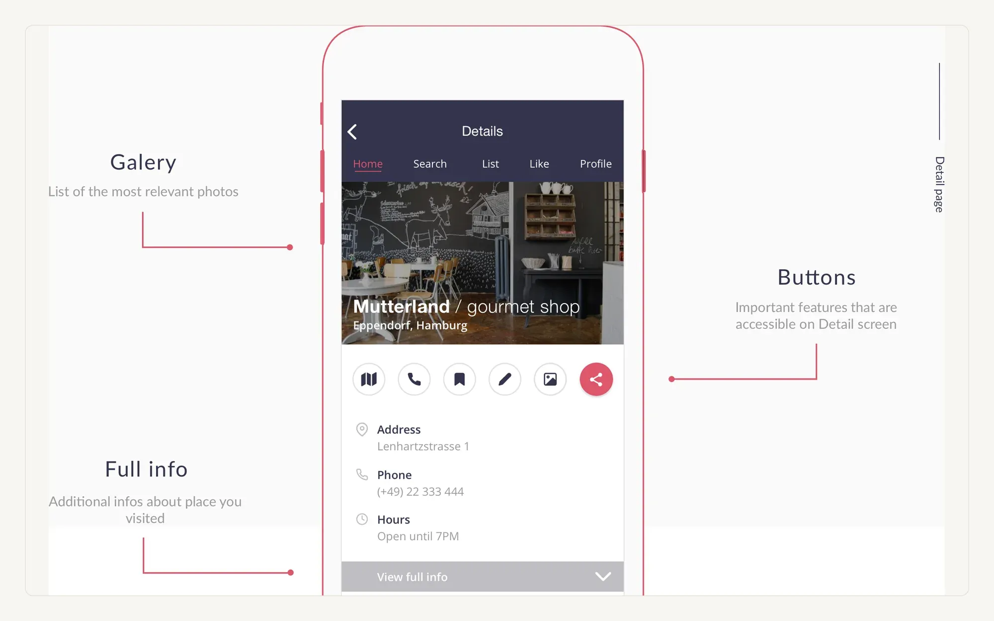
A self-initiated redesign of the Foursquare city guide — a full pass at the branding, the browse funnel and the place detail page.
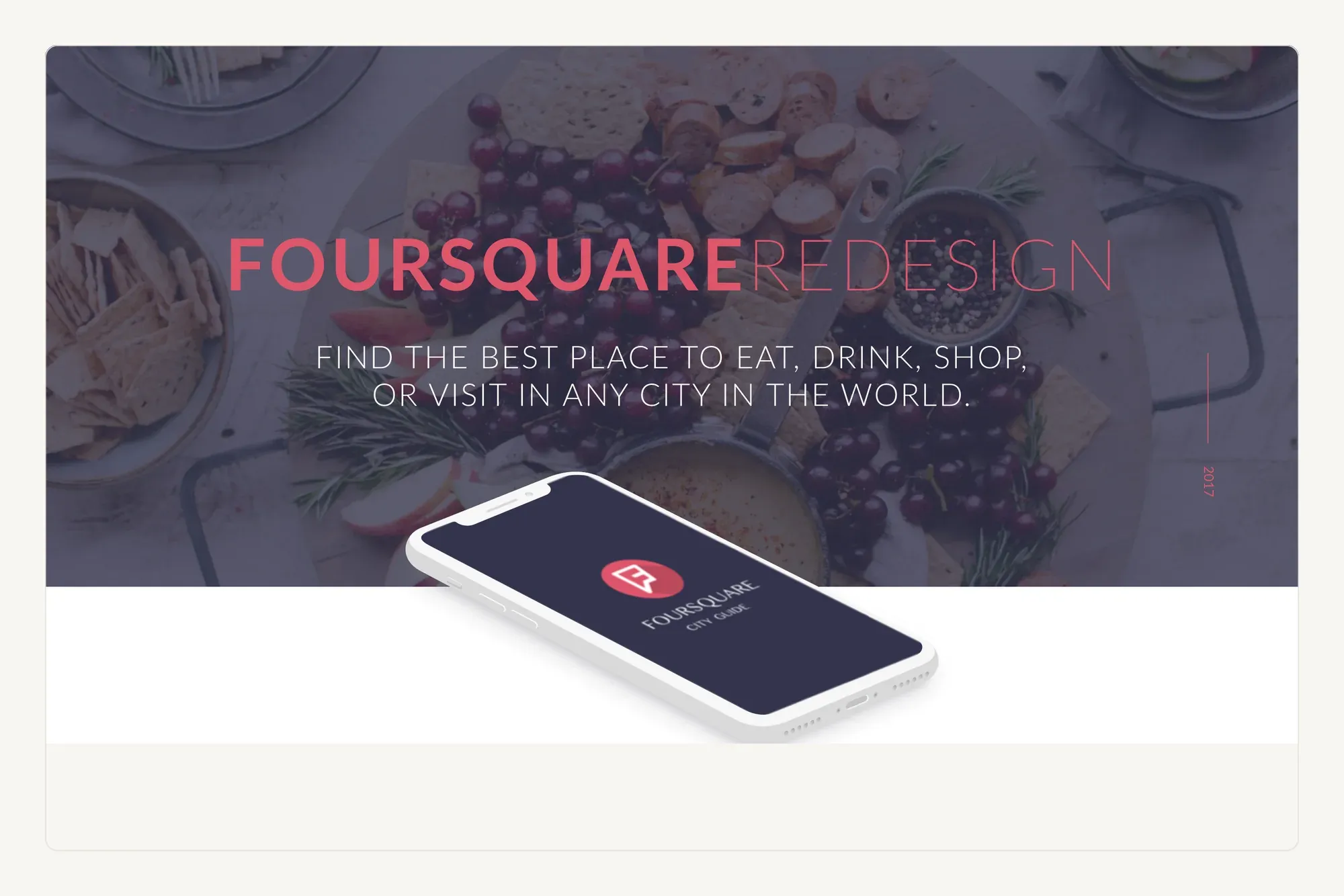
An unsolicited redesign is a good way to practise the unglamorous part: picking a small system and then holding to it across every screen, including the ones nobody screenshots.
A concept, not a brief
Nobody asked for this one. Foursquare's city guide was the app I reached for most and argued with most, which makes it good practice material — the constraints are real even when the client is imaginary.
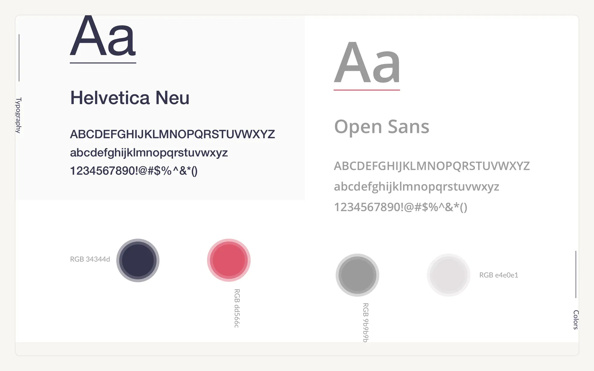
Type, colour, and one card
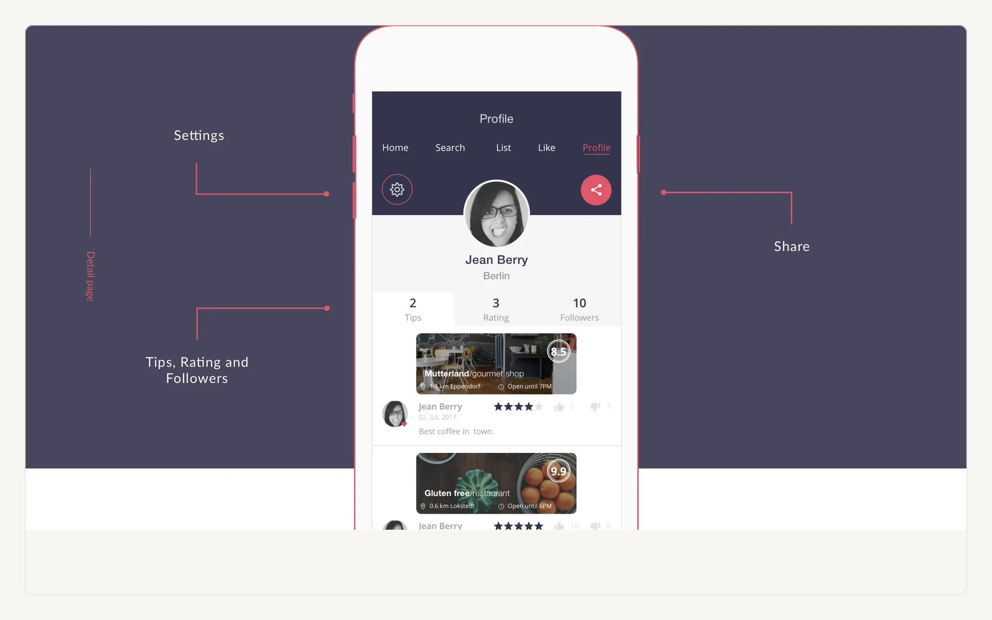
The visual system is deliberately small: two typefaces, a deep aubergine with a single warm red, and one card component. If the card works for a restaurant, a bar and a park, the rest of the app mostly designs itself.
Browsing by intent
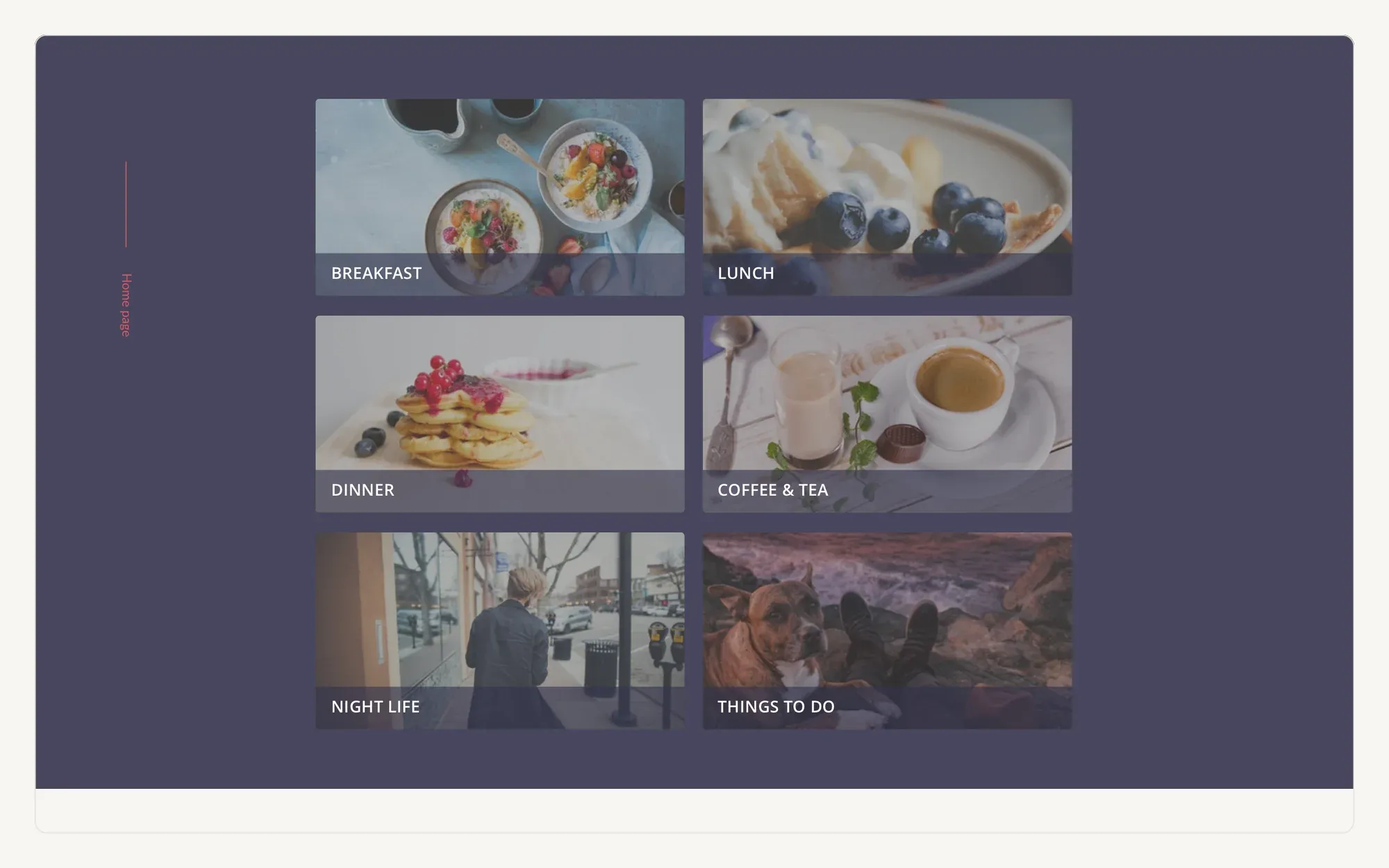
The entry point is not search, it is intent — breakfast, lunch, dinner, coffee, night life, things to do. Each category leads with photography because that is what people actually judge a place on before they read a single review.